Interactive Radar Visualization
Overview
Within this cookbook, we will detail how to create interactive plots of radar data!
- Reading data with Xradar
- Creating your first interactive figure with Xradar + hvPlot
- Combining your plots into a single dashboard
- Filtering and Checking Data Quality
- Create a Dashboard to Analyze ZDR Bias
Imports
import xradar as xd
import fsspec
import pyart
from open_radar_data import DATASETS
import hvplot.xarray
import holoviews as hv
import panel as pn

hv.extension("bokeh")
Prerequisites
It is recommended that you are familiar with working with weather radar data, the core data structures, and the basics of reading in different radar datasets.
| Concepts | Importance | Notes |
|---|---|---|
| Intro to Cartopy | Necessary | |
| Xradar User Guide: Plot a PPI | Necessary | |
| Understanding of NetCDF | Helpful | Familiarity with metadata structure |
- Time to learn: 30 minutes
Reading Data with Xradar
While we have focused much of the content around the Python ARM Radar Toolkit (Py-ART), Xradar is another helpful package we can use to work with this in xarray!
Here, we use data from the Colombian weather radar network, using some remote access tools such as fsspec.
fs = fsspec.filesystem("s3", anon=True)
files = sorted(fs.glob("s3-radaresideam/l2_data/2022/08/09/Carimagua/CAR22080919*"))
files
Once we have our files of interest, we can load one in. Let’s read in a single file - for example, we are interested in the 8th file (index=7)
task_file = fsspec.open_local(f'simplecache::s3://{files[7]}',
                                s3={'anon': True},
                                filecache={'cache_storage': '.'})
Read the data in xradar
We use xradar, an open-source toolkit to read weather radar data and load into the Xarray data structure. The data format here is an IRIS file, so we use the open_iris_datatree reader.
radar = xd.io.open_iris_datatree(task_file).xradar.georeference()
radar
Creating Your First Interactive Figure with Xradar and hvPlot
hvPlot is helpful tool when working with interactive visualizions! It is a tool built on top of several other packages, that we can use with Xarray.
By default, this visualization plots azimuth along the y-axis and range along the y-axis. While this is desired in certain cases, we cannot gather much spatial information from this.
ref = radar["sweep_0"].DBZH.hvplot.quadmesh(cmap='pyart_ChaseSpectral',
                                            title='Horizontal Reflectivity (dBZ)',
                                            clim=(-20,60))
ref
Refining Our Plot - Recreating a Plan Position Indicator (PPI)
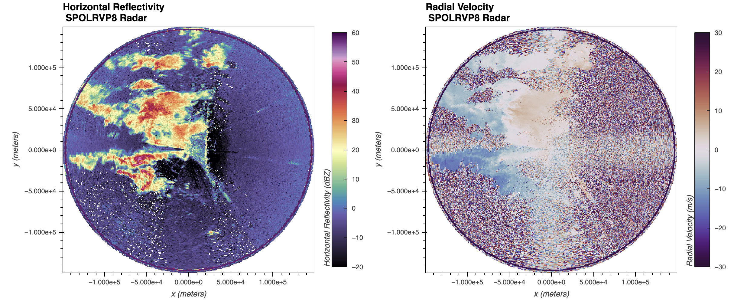
We instead would like to create a Plan Position Indicator (PPI) plot. Since we already georeferenced the dataset, we set x/y to be x and y, or the distance away from the radar, as well as tuning some additional parameters. We set rasterize=True to lazily load in the data, which renders the plot more quickly and increases resolution as we zoom in.
ref = radar["sweep_0"].DBZH.hvplot.quadmesh(x='x',
                                           y='y',
                                           cmap='pyart_ChaseSpectral',
                                           clabel='Horizontal Reflectivity (dBZ)',
                                           title=f'Horizontal Reflectivity \n {radar.attrs["instrument_name"]} Radar',
                                           clim=(-20, 60),
                                           height=500,
                                             rasterize=True,
                                           width=600,)

ref
zdr = radar["sweep_0"].ZDR.hvplot.quadmesh(x='x',
y='y',
cmap='pyart_ChaseSpectral',
clabel='Differential Reflectivity (dB)',
title=f'Horizontal Reflectivity \n {radar.attrs["instrument_name"]} Radar',
clim=(-1, 6),
height=500,
rasterize=True,
width=600,)
zdrCombining your plots into a single dashboard
You can combine plots using the + syntax to add plots side-by-side, or * to add them to the same plot. For example, let’s combine our reflectivity and velocity plot.
(ref + zdr).cols(1)Filtering and Checking Data Quality
We can also filter our data - notice the low values in both differential reflectivity and reflectivity. We can mask these out using Xarray!
# Subset our first sweep
ds = radar["sweep_0"].to_dataset()
Determine Mask Thresholds
Let’s determine our thresholds for filtering the data, using histograms! These are available through hvPlot, using the .hvplot.hist() extension.
zdr_hist = ds.ZDR.hvplot.hist()
ref_hist = ds.DBZH.hvplot.hist()
(zdr_hist + ref_hist).cols(1)
Notice how we have very low values for both fields, which we can threshold using:
- Differential Reflectivity < -5
- Horizontal Reflectivity < -32
ds = ds.where((ds.ZDR >= -5) & (ds.DBZH != -32))
ds
Double Check our Filtered Data
Let’s double check that our filtering worked - notice the new, more representative distributions!
zdr_hist = ds.ZDR.hvplot.hist()
ref_hist = ds.DBZH.hvplot.hist()
(zdr_hist + ref_hist).cols(1)
Create a Dashboard to Analyze ZDR Bias
A common data quality check is differential reflectivity bias. This value should be around 0 for low values of horizontal reflectivity. We use a few steps here to create this visualization
- Unstack the dataset so we are left with a single dimension - the single range gate (single points)
- Create histograms (
.hist) and a 2-dimensional histogram (.hexbin) to visualize the data - Stack these into single view using
gridspec
ds = ds.stack({"gate": {"azimuth", "range"}}).reset_index("gate")

hist_dbz = ds.hvplot.hist("DBZH",
                          width=500,
                          height=200,
                          title="Horizontal Reflectivity Distribution",)
hist_zdr = ds.hvplot.hist("ZDR",
                          height=400,
                          title="Differential Reflectivity Distribution",
                         ).opts(invert_axes=True)
hexbin = ds.hvplot.hexbin(x='DBZH',
                          y='ZDR',
                          title='Reflectivity vs. Differential Reflectivity Distribution',
                          width=500,
                          height=400) *  hv.HLine(0,
                                                  label='Differential Reflectivity = 0 Line').opts(color='red',
                                                           line_width=1)

gspec = pn.GridSpec(width=800, height=400)

gspec[0,   0:2  ] = hist_dbz
gspec[1:3,   0:2  ] = hexbin
gspec[1:3,   2  ] = hist_zdr

gspec
Summary
Within this notebook, we covered how to use interactive visualizations with your weather radar data, including applications to checking data quality.
What’s Next?
Next, we will continue to explore methods of cleaning and visualizing data!